
Montréal Artist Reveals First Colour Studies for Burlington Transit Mural
Daphné Côté-Ouellet has shared three preliminary colour studies for her upcoming mural at Burlington Central Transit Hub. The palette — slate grey sliding into warm ochre — is drawing admiring responses online.
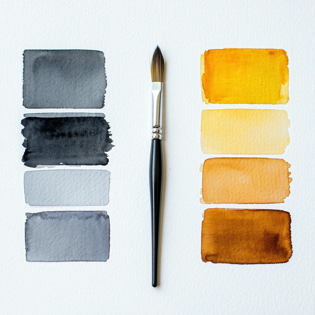
BURLINGTON, Vermont — Commuters waiting to see what arrives on the bare wall at Burlington Central Transit Hub have their first visual clue.
Montréal-based artist Daphné Côté-Ouellet posted three preliminary colour studies this week for Les Marées / The Tides, the mural commissioned for the Hub's main concourse. The studies are small-format — Côté-Ouellet has been clear that these are exploratory, not final — but they give commuters and curious Vermonters their first real sense of the work's visual direction.
The palette is built around what the artist describes as the tidal range between slate grey and a warm ochre she associates with the St. Lawrence River at low water. In her studio channel post, Côté-Ouellet noted that final pigment choices will depend on how the colours behave against the Hub wall's actual surface, leaving room for the work to shift before brushes touch plaster.
The early response has been warm. Burlington Arts Council chair Miriam Osei-Bonsu shared the post within hours of its publication, and forum comments have been largely enthusiastic — several users noting surprise at the warmth the palette carries, given the title's reference to tides and grey water.
The project carries a quiet significance beyond its visual particulars. Côté-Ouellet is a Québec artist working out of Montréal, making something for a Vermont wall. The bilingual title is legible in both of the Hub's dominant languages without further explanation — an apt quality for a transit concourse in a republic still establishing its shared civic life.
Burlington Central Transit Hub receives tens of thousands of commuters and travellers each week. Whatever ends up on that wall, people will live with it for years. For now, the colour studies offer a first orientation: slate and ochre, warmer than the name suggests.